A landing page example is only useful if it comes from your kind of business. A therapist and a personal trainer need the same skeleton (headline, offer, proof, questions, button), but a different tone, different proof and a different way to get in touch. A law firm page written like a gym page drives clients away, and the other way round.
So instead of a gallery of screenshots, this guide gives annotated layouts by industry: the goal, a sample headline, the order of blocks, the proof that works, the button, and what to watch out for. These are patterns we describe, not pages of real businesses, and the headlines are examples to adapt.
What makes a landing page good: five criteria
| Criterion | What it means in practice |
|---|---|
| One goal | One action, one main button. No menu leading elsewhere |
| A clear offer | What you get, who it's for and the first step. "Free 20-minute consultation", not "Contact us" |
| Proof that fits the industry | Reviews, photos of work, licenses, experience. Each industry has its own |
| An answer to the main worry | Price, privacy, time, "is this for me?", "what if it doesn't work?" |
| Built for phones | Button on the first screen, fast load, text big enough to read |
Landing page for a lawyer
Goal: a first consultation or a phone call.
Sample headline: "Uncontested divorce in Austin, handled start to finish. Flat-fee first meeting at our office or by video."
Blocks, in order:
- A headline naming one practice area, not "full-service law firm".
- Who it's for, in three short bullets.
- How the process works, step by step. People looking for a lawyer are stressed, and a clear process calms them.
- Who you are: years in practice, bar admission, focus areas, a real photo.
- FAQs: rough cost, how long it takes, what to bring.
- A short form or a call button, with a line about confidentiality.
Watch out for: state bar advertising rules, most of them based on the ABA's Model Rule 7.1 against false or misleading communications. Don't promise outcomes or call yourself "the best", and check whether your state requires a label such as "Attorney Advertising" (New York does) or limits how past results are described. In the form, don't ask people to describe their case in detail.
Landing page for a therapist or counselor
Goal: a short intro call, by phone or message.
Sample headline: "Feeling stuck? Therapy for adults, in person in Portland or online across Oregon."
Blocks, in order:
- A headline describing the struggle in the client's words, not clinical terms.
- A warm, personal line about how you work.
- What you help with: anxiety, life transitions, relationships. Only what you actually treat.
- Your license and training, exactly as they are. Titles such as "psychologist" and "licensed counselor" are protected by state law, so use the title on your license.
- What happens in the first session, how long sessions are, the fee or range, and whether you take insurance.
- A button for a call or a message with a pre-filled text such as "Hi, I'd like to book an intro call."
Watch out for: pressure language ("last spots!") damages trust. Keep the form minimal, never ask for health details, and say who reads the message. If you plan to add ad-tracking code, check health-privacy rules first: HIPAA applies to many providers, and some states have their own health-data laws. Reviews here are usually anonymous, which is fine as long as they're real.
Landing page for a personal trainer or fitness studio
Goal: a trial session or a class sign-up.
Sample headline: "Strength training for women over 40, in small groups in Columbus. Your first class is $15."
Blocks, in order:
- A headline with a defined audience. "For everyone" attracts no one.
- A short video or photos from a real class, with people who look like your audience.
- What membership includes: sessions per week, group size, location and times.
- Member stories, with permission and first names.
- FAQs: "I'm out of shape, is this for me?", "What if I miss a class?"
- A button to book the trial or send a message.
Watch out for: before-and-after photos only with written permission, and no promises like "lose 20 pounds in a month". The FTC's Endorsement Guides FAQ says that if a testimonial shows an exceptional result, the ad must make clear what people can generally expect.
Landing page for an accountant or bookkeeper
Goal: a fit call or a quote.
Sample headline: "Just started freelancing? Bookkeeping, quarterly estimates and your tax return for one monthly fee."
Blocks, in order:
- A headline that defines the audience: new freelancers, small LLCs, landlords.
- What's included, in a clear list, and what isn't.
- How working with you looks: sending receipts, the app you use, the annual meeting.
- A starting price or range, if you're willing to publish one. It filters out poor-fit enquiries.
- Who you are: license or credential, years of experience, specialties.
- A short form with a dropdown for business type and size.
Watch out for: "CPA" is a licensed title regulated by state boards of accountancy. If you're a bookkeeper or enrolled agent, say exactly that. Busy season sells: a January page about tax deadlines does better than a generic one.
Landing page for an interior designer
Goal: a first consultation.
Sample headline: "Interior design for new-build homes in the Phoenix area, from floor plan to move-in day."
Blocks, in order:
- A large photo of a project you completed, not a generic render.
- The kinds of projects you take: new homes, remodels, offices.
- A short gallery of 6-9 photos with one-line captions, and a link to the full portfolio.
- Your process and what the client receives at each stage.
- Client testimonials with the project type or town.
- A form asking for property type, rough size and location.
Watch out for: a heavy gallery kills speed. Compress every image and test the page in PageSpeed Insights.
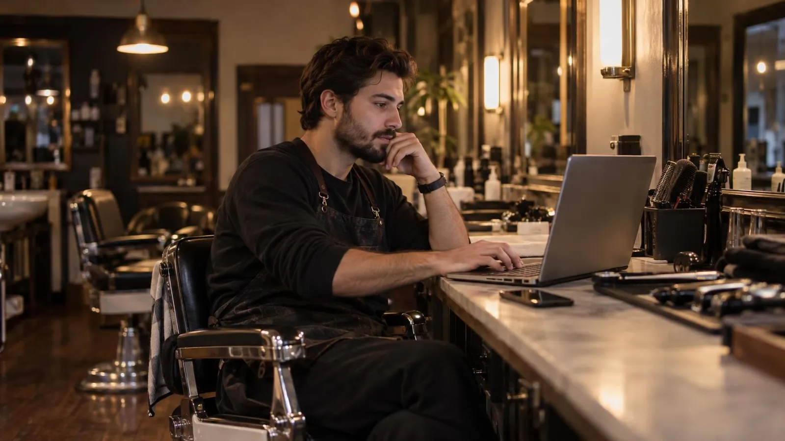
Landing page for a barber or hair salon
Goal: a booked appointment.
Sample headline: "Fades, beard trims and hot-towel shaves in downtown Raleigh. Book online in under a minute."
Blocks, in order:
- A booking button at the very top.
- Lots of photos of real cuts. In this industry the photo is the proof.
- A short, clear price list.
- Address, hours, parking and a map link.
- Google reviews. Ask every happy client with a review link or QR code, but don't offer a discount for it: Google's review policy prohibits incentives for reviews.
- A message button for people who prefer to ask first.
Watch out for: without a booking system, a WhatsApp or text button with a pre-filled message works well, as long as someone answers. Setup is in WhatsApp marketing for small business.
Landing page for a contractor or home service
Goal: a fast call or a quote request.
Sample headline: "Licensed plumber in San Diego. Same-day visits for most calls, and a price before we start."
Blocks, in order:
- Call and message buttons at the top, plus a sticky call button on mobile.
- The exact service area, by town or ZIP code.
- Types of jobs, with before-and-after photos of your own work.
- How pricing works.
- Reviews.
- License number, insurance and full business details. In this industry trust is everything.
Watch out for: many states require the license number in advertising. In California, for example, the Contractors State License Board's advertising guidelines require it in all forms of advertising, including websites and posts that solicit business online. And don't write "24/7" if nobody picks up at 2 a.m. For local search ads that send people to a page like this, see Google Ads for small business.
Landing page for an online course, ebook or digital product
Goal: a purchase.
Sample headline: "The practical guide to balcony gardening: 120 pages, from your first pot to your first harvest."
Blocks, in order:
- A benefit headline with an image of the book or course.
- Who it's for, and who it isn't for.
- What's inside: table of contents or syllabus.
- A sample: the first chapter, a clip from a lesson.
- About the author or teacher.
- Price, payment methods, delivery if physical.
- FAQs and the refund policy.
- A buy button, repeated down the page.
Watch out for: this is the only page in the list where people decide alone, without a conversation, so it's longer. State the refund policy plainly, avoid income promises for business courses, and test checkout on a phone.
What all the good examples share
- A specific offer. One service, one audience, one clear first step.
- Real proof. Your photos, real customers' reviews, your actual credentials. If you don't have reviews yet, don't invent them; the FTC's rule on fake reviews applies to small businesses too. Write about your process and experience instead.
- The main worry answered. Confidentiality for a lawyer, price for a contractor, "is this for me?" for a trainer.
- The right contact method. Online booking for a barber, a call for a plumber, a message for a therapist.
- Accessible, honest footer. Business name, contact details, a privacy note about how you use form data.
A layout template to copy
Copy this table into a document and fill it in before you open any builder:
| Block | What you write |
|---|---|
| Headline | What they get + who it's for + one detail that lowers risk |
| Subheadline | Time, place, starting price or experience |
| Main button | One action: "Book a free intro call", "Book your cut" |
| Photo | You, your place or your work, not stock |
| What's included | 3-5 bullets |
| Proof | 2-4 real reviews, photos of work, credentials |
| FAQs | 3-5 questions customers really ask |
| Repeated button | The same action |
| Footer | Business details, license if relevant, privacy note |
With the template filled in, you can build the page yourself following how to build a landing page with an AI generator. If you'd rather not, PowerAds.ai, an AI marketing agent that works in WhatsApp and a web chat, can take the same information: it shows a plan with cost and timing, and builds the landing page after you approve, leaving you to check the copy and swap in your own photos. Where the page fits in the rest of your marketing is covered in how to market a small business.