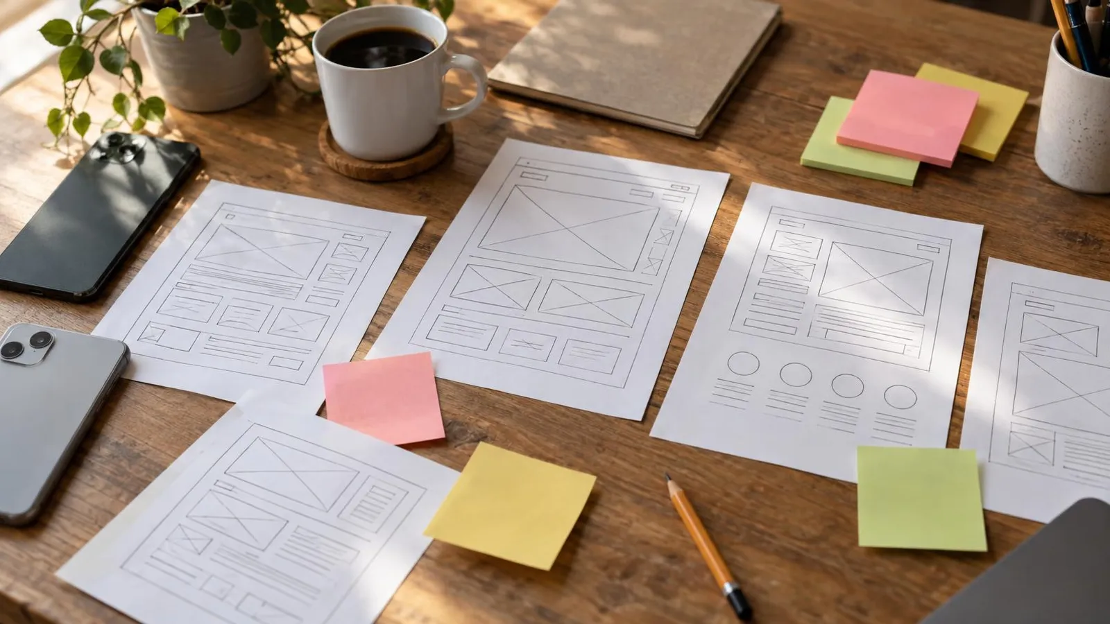
A landing page is a single web page built for one action: the visitor books, calls, sends a message, requests a quote or buys. It's where you send people who clicked an ad on Facebook or Google, so it talks only about the offer in that ad. No menu, no "About us" tour, no ten ways to leave.
A landing page that converts follows a fixed pattern: a headline that says what people get and who it's for, proof that you can be trusted, answers to the questions that stop people, and one button that repeats down the page. It loads fast on a phone, works for people with disabilities, and is connected to tracking so you know whether it brings enquiries.
This guide covers the full structure, headline examples, form versus call versus message, Google's speed thresholds, trust and legal basics, connecting the page to ads, realistic conversion rates, and a checklist before you go live.
Landing page vs website: what's the difference?
A website is the shop window for the whole business: home page, services, about, blog, contact. A visitor can browse, compare and read. That suits someone who found you on Google and wants to get to know you.
A landing page does the opposite. It narrows. The person arriving has already seen an ad with a specific offer, say "Free 20-minute bathroom remodel estimate" or "First Pilates class $15". Everything unrelated to that offer is a distraction, so there's no main menu, and there's one goal you can measure.
| Landing page | Website | |
|---|---|---|
| Goal | One action: enquiry, booking, purchase | Present the business and build trust |
| Where visitors come from | Ads, emails, a link in a post | Google search, referrals, typing your name |
| Navigation | No menu, very few links | Full menu, many pages |
| How you measure it | Share of visitors who acted | Traffic, engagement, general enquiries |
| How many you need | One per offer or audience | One |
Do you need both? If you run ads, usually yes. Sending paid clicks to a homepage makes people hunt for the offer they clicked on, and many give up. If you don't run ads and rely on Google search and referrals, a good website with a clear contact page may be all you need for now.
Anatomy of a landing page that converts
People read top to bottom and decide in the first seconds whether to keep scrolling, so order matters. This structure works for most small businesses, from a dental practice to a roofer:
| Section | What it must do | Common mistake |
|---|---|---|
| Headline | Say what they get and for whom, in the ad's own words | A clever slogan that says nothing ("A different experience") |
| Subheadline | Add a detail that lowers risk: time, price, area, experience | Repeating the headline in other words |
| First button | Appear on the first phone screen | A button only at the very bottom |
| Real photo | Show you, your place or the result | Stock photo of people smiling at a laptop |
| What's included | 3-5 short bullets, each with a benefit | A long paragraph about "our vision" |
| Proof | Named reviews, before and after photos, licenses | Anonymous quotes or reviews that look invented |
| Objections answered | Price, time, "what if it's not for me?" | Ignoring the question everyone asks |
| Repeated button | After each major block, plus a sticky button on mobile | Three different buttons with three different goals |
| Business details | Name, address or service area, phone, privacy note | No identifying details, so it looks like a scam |
Two principles hold the whole thing together. First, one goal. If you want enquiries and newsletter sign-ups and Instagram followers, build two pages. Second, every block answers a question the visitor is silently asking: "What is this?", "Is it for me?", "Can I trust them?", "What does it cost?", "What do I do now?"
To see this skeleton applied to eight industries, from lawyers to contractors, see our small business landing page examples.
Writing a headline that works
The headline does most of the work. A simple formula: what they get + who it's for + what lowers the risk. Plain words, no big claims.
| Business | Weak headline | Stronger headline |
|---|---|---|
| Physical therapist | "Your body, your health" | "Lower back pain? Full assessment and first treatment in Leeds city centre" |
| Remodeler | "Remodeling, elevated" | "Bathroom remodels in Phoenix. Detailed written quote within 48 hours" |
| Pilates studio | "Movement is life" | "Reformer Pilates in groups of 6 or fewer. First class $15" |
| Bookkeeper | "Your financial partner" | "Just went self-employed? Bookkeeping and your tax return for one monthly fee" |
A few rules worth keeping:
- Match the ad. If the ad said "first class $15", the headline says "first class $15". A visitor who doesn't immediately recognize they're in the right place hits back.
- Numbers over adjectives. "Within 48 hours" convinces more than "fast service". Just don't promise a number you can't keep.
- Talk to the reader. "You" and "your", not "our clients".
- No promises you're not allowed to make. Health, legal and financial services have advertising rules, and "guaranteed results" is both unconvincing and risky.
Form, call, text or booking: which button?
Most visitors arrive on a phone, and many would rather tap to call or send a message than fill in a form. That doesn't make forms obsolete. Choose based on what happens after the tap.
| Contact method | Fits when | What it needs from you |
|---|---|---|
| Short form | You need fixed details (area, job type, date) or you call back at set times | Fast follow-up and one place to keep enquiries |
| Tap to call | Urgent services: locksmith, plumber, towing | Someone actually answering during ad hours |
| Text or WhatsApp | Personal services where questions vary and people want a quick answer | A reply within minutes or an hour, not tomorrow |
| Online booking | Standard services with open slots: a class, a cut, a first consultation | An up-to-date calendar and reminders |
For a WhatsApp button, use WhatsApp's official click to chat link: wa.me followed by the full number in international format, with no plus sign, spaces or dashes. You can add a prefilled message such as "Hi, I came from the free estimate page" so you know which campaign the enquiry came from.
On forms, every extra field costs enquiries. Name and phone or email is enough for most businesses. If you need one more detail, use a dropdown rather than an open field. Next to the button, say what happens next: "We'll call you back today before 6pm."
Landing page best practices for mobile and speed
Someone who taps an Instagram ad waits a few seconds at most. A heavy page burns the money you paid for the click. Google defines three Core Web Vitals, and the "good" thresholds are: the largest content element loads within 2.5 seconds (LCP), the page responds to a tap within 200 milliseconds (INP), and layout shift stays at 0.1 or less (CLS), measured at the 75th percentile of page loads.
What that means in practice:
- Images. Compress every image before uploading. A phone photo is often several megabytes; on a landing page it should be tens or a few hundred kilobytes.
- Video. Don't autoplay a video at the top. A still image with a play button is lighter. If you use video, a short vertical clip works well; our Reels and TikTok ideas include several that double as landing page videos.
- Sticky button. On mobile, a call or message button that stays at the bottom of the screen saves scrolling back up.
- Fonts. One typeface, two weights at most.
- Add-ons. Every chat widget, popup and tracking script adds load time. Keep only what you actually use.
Test the page in Google's PageSpeed Insights before launching a campaign and after every big change. Also test by hand on your own phone and an older one, on mobile data rather than Wi-Fi.
Trust, accessibility and privacy
Trust is built from small details: the business name, a real address or service area, a license number if your trade uses one, real photos and named reviews. A page without identifying details looks like another dodgy ad.
Never invent proof. The FTC's final rule on fake reviews and testimonials (August 2024) bans fake reviews, including AI-generated ones from people who don't exist, and undisclosed reviews from your own staff. If you're new and have no reviews yet, show your process, credentials and photos of your work instead.
Accessibility matters legally as well as commercially. The U.S. Department of Justice's guidance on web accessibility says the ADA applies to the goods and services businesses open to the public offer online, and in the UK the Equality Act 2010 requires service providers to make reasonable adjustments for disabled people. WCAG level AA (version 2.1 or 2.2) is the usual benchmark. A simple landing page is the easiest kind to get right: proper heading structure, alt text on images, enough color contrast, labeled form fields and buttons that work from a keyboard.
On privacy: when you collect a name, phone or email, say in plain words next to the form who you are, why you're collecting it and what you'll do with it, and link to a privacy policy. If you want to send marketing emails or texts later, add a separate unticked consent box. Email marketing has its own rules (CAN-SPAM in the US, PECR and UK GDPR in the UK), and automated marketing texts in the US generally need prior written consent under the TCPA. This is general information, not legal advice.
Connecting the page to ads and tracking
A landing page without tracking is a guess. Before you spend a dollar on ads, make sure of three things:
- The platform's tracking code. For Facebook and Instagram that's the Meta Pixel; for Google it's the Google Ads conversion tag. Without them the platform doesn't know who converted and can't learn whom to show the ad to.
- A defined conversion event. A form submission, a tap on the call or message button, or a visit to a thank-you page. Sending every enquiry to a separate thank-you page makes it easiest to measure.
- UTM tags on your links, so your analytics show which campaign and which ad each visit came from.
On Google the page also affects what you pay. Landing page experience is one of the three components of Quality Score for search ads, alongside expected clickthrough rate and ad relevance. A page that matches the search term and loads fast helps lower your cost per click. The rest of the campaign setup is in our Facebook ads guide for small business.
On Meta there's an alternative worth knowing: Instant Forms that open inside Facebook or Instagram with no landing page at all. They're easier for the visitor, but leads from them tend to be less committed because the details fill in automatically. A landing page gives you room to explain, filter and build trust before the enquiry.
What is a good landing page conversion rate?
Conversion rate is the share of visitors who took the action you wanted. Unbounce's 2024 Conversion Benchmark Report, built on more than 41,000 landing pages and 57 million conversions, put the median across all industries at 6.6% (Unbounce). Treat that as a rough reference, not a target. A free estimate converts very differently from a $2,000 purchase, and cold Facebook traffic behaves differently from people who searched for your service by name.
The benchmark that matters most is your own last month. And count customers, not just form fills: a page that brings more enquiries but fewer paying customers isn't winning.
A/B testing on a small budget
An A/B test runs two versions of the page side by side to see which brings more enquiries. The catch for a small business: with dozens of enquiries a month rather than thousands, a small difference between versions can be pure chance. So how do you improve?
- Test big changes. A different offer ("free first class" against "first class $15"), a completely different headline, or a different contact method. Not button colors.
- One change at a time. If you change the headline and the photo, you won't know which one worked.
- Give it time. At least one or two weeks per version, so you include weekdays and weekends.
- Measure quality, not just quantity. Note next to each enquiry whether it became a customer.
- Listen to the enquiries. Questions people keep asking by phone or message are the best clue to what the page is missing.
How to build one: three routes
| Route | Fits | Watch out for |
|---|---|---|
| Yourself, with a website builder or AI generator | You have time, copy ready and a tight budget | Free-plan limits, accessibility and tracking are on you |
| Designer, freelancer or agency | You want a unique design and someone accountable | Depending on them for every small change; wide price range |
| An AI agent that builds the page and runs the campaign | You want a page fast and connected to ads without managing several suppliers | You still need to check the copy, the offer and the details before launch |
If you want to try it yourself, our step-by-step guide to building a landing page with an AI generator covers what free plans include and how to connect a form and tracking.
One option for the third route is PowerAds.ai, an AI marketing agent that works in WhatsApp and a web chat, in English and Hebrew. You describe what the business needs; it shows a plan with cost and timing and builds the landing page after you approve. It can also run the Meta or Google Ads campaign that sends traffic to the page, and anything that costs money appears as an approval card and runs only after you explicitly approve it. To promote the page organically too, mix it into your regular content using our social media post ideas, and size your ad images with the social media image sizes cheat sheet.
Checklist before you go live
| Check | How |
|---|---|
| The headline says what they get and for whom | Give someone who doesn't know the business 5 seconds and ask what you offer |
| One goal and one main button | Count the different kinds of buttons on the page |
| The button shows on the first phone screen | Open the page on a phone without scrolling |
| Call and message links work | Tap them from another phone |
| The form submits and reaches you | Send a real test enquiry |
| The page loads fast | PageSpeed Insights plus a manual test on mobile data |
| Proof is real | Named reviews, your own photos |
| Business details and privacy note are there | Scroll to the bottom |
| Tracking and conversions fire | Check Meta Events Manager or Google Ads that the event registered |
| The ad and the page say the same thing | Put them side by side |
A landing page isn't a one-off project. After two weeks of a campaign you have data: where visitors came from, how many enquired, what they asked. That's the moment to sharpen the headline, add an answer to the question that keeps coming up, and check whether the offer itself is clear enough. The other half of the job is keeping people coming to it; our guide to social media for small business covers the organic side.